
Check out genially to create interactive images, timelines, maps and more
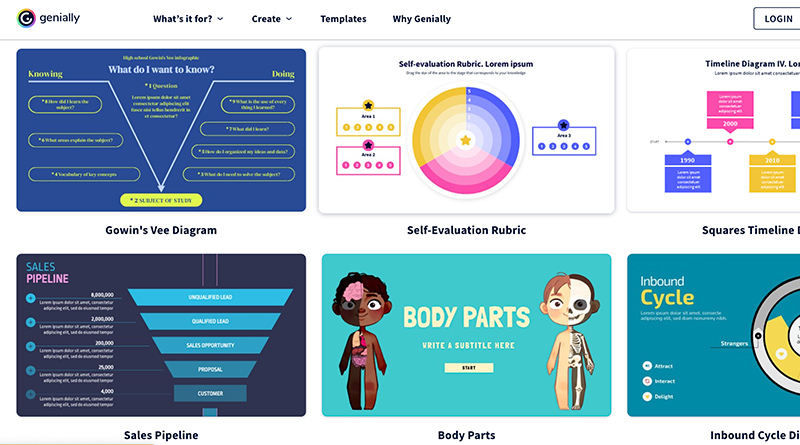
In our online publication, one goal is that each story does something that can’t be done in print. For this reason, students frequently seek out interactive tools to enhance their storytelling. A current favorite of my staff is Genially. It can be used to create interactive images, timelines, maps and more. Here are some of the ways my staff members have used it and what they have to say about it:
Grace Hamilton
Reporting on ChatGPT, it was important to showcase for viewers who may be unfamiliar
with what responses the software is capable of. Thus, I selected a robot theme and inputted each prompt with the output response from ChatGPT, allowing each viewer to click through and view responses that piqued their interest.
Genially achieves what few platforms can — it allows the reader to visualize a topic beyond writing and forces them to actively engage in the alternative content you present. With a range of pre-made templates alongside blank templates, the program is incredibly user-friendly
Genially is an incredible tool for any kind of alternative storytelling, particularly timelines and infographics. You want to avoid overloading your reader with text, and Genially allows any alternative text to become secondary.
Sophia Bateman
I used Genially for my article about Priya Shah’s cancer research last year. I used it to create a timeline about her process and show when she completed each step of her research.
It was easy to choose the template because there are a lot of options, and also editing it in general isn’t too difficult because all of the basic tools like text formatting/color/size and graphic icons are easy to find.
I would recommend this tool to others when they are writing stories that include a series of chronological events that you can’t add pictures for (because in that case I would suggest the timeline templates in StoryMap) and also when you can use it to create a cool interactive image. I think the interactivity aspect of it makes it more engaging and fun for readers, so it’s definitely a great tool to use to add some extra detail to an article.
Ruby Rogers
I used Genially for the Head of School piece. Genially is a website where users can make creative and interactive graphics for presentations, multimedia features, etc. I chose to use it because it is very easy to navigate and is very beginner friendly but also creates good quality content.
What worked for me was how easy it is to customize the interactive features – whether it was making something move around the screen, or pulling up text, or unveiling another image, I found that there were lots of different features that I could use without any proper guidance.
I would definitely recommend Genially to others because it is great for beginners and really easy to navigate. It is a very flexible platform, as there is so much you can do on it, and it creates good quality content.
Clara Martinez
I used it for my stories on summer rewind playlist and the death of the Queen. I chose to use Genial.ly for the summer rewind playlist as a way to list different songs in a way that would appear more engaging than simply listing them out as text. I used Genial.ly for the Queen story to give our American audience more background on the legacies of the royals to provide more context for the magnitude of the Queen’s death.
The tool is great for visual elements that are unusable on other platforms like KnightLab. Each graphic looks personalized and unique because of the wide variety of available formats. The text is also easy to maneuver and resize, which can sometimes be more finicky on other websites like Infogram or Canva.
I recommend this tool to anyone who is looking to recreate a sidebar effect online. It is a visually engaging way to communicate information that doesn’t quite fit within the text of the article. And, in all honesty, Genial.ly graphics look much more complex than the effort it takes to make, especially compared to other platforms.
Eden Leavey
I used Genially to create an interactive map for my story Astroworld Festival tragedy exhibits lack of concert security. When you hover your mouse over one of the interactive markers on the map, a blurb appears. I used this tool to further develop readers’ understanding of global live music casualties by writing about events and linking them to their corresponding location.
Everything is customizable! From fonts to colors to icons, there are many options to choose from. It is so easy to create a piece of multimedia that is cohesive with the rest of your story.
The program has so many templates and options that I think any story could benefit from a supplementary Genially. My favorite tools are the interactive infographics, which allow you to create maps, timelines and diagram.
The students did report some downsides to using the program:
Genially can be finicky at times, particularly when trying to work with the pop-up interactive text boxes. Navigating the different elements when first using the platform is similarly difficult. – Hamilton
Some of my frustrations were that there were a limited number of color palettes to choose from, so if you don’t like the color options on the timeline templates you have to spend a lot of time creating your own and changing the colors which is just time-consuming. – Bateman
I found that on platforms such as Canva, there are more creative stickers and images that you can use to add to your graphic. – Rogers
Although the tool has many great templates, it can be more challenging to find individual elements like Canva that you can manipulate and recolor. – Martinez
The program can be a little fidgety. I felt frustrated making adjustments and aligning certain features on the page. – Leavey
Additional information:
The support is easy to navigate with a search option and articles to browse.
There are three types of paid plans available but the free option includes unlimited creations and the ability to embed them on your site.
Genially can be used as a teaching tool. Their Academy offers beginning, intermediate and advanced courses from 4 to 180 minutes in length on a variety of topics related to visual design, teaching, and more.