
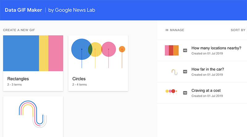

Data GIF Maker creates quick, slick visuals
Something interactive — or different — can capture attention easily. I learned about Data GIF Maker from Google News Lab from Try This!, a weekly newsletter on tools for journalism.
The big idea: Adding data to any post just got a million times easier. The free tool allows users to create GIFs in rectangle, circle or racetrack format.
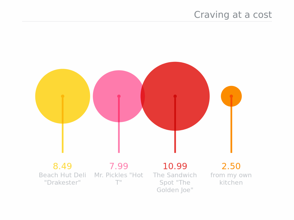
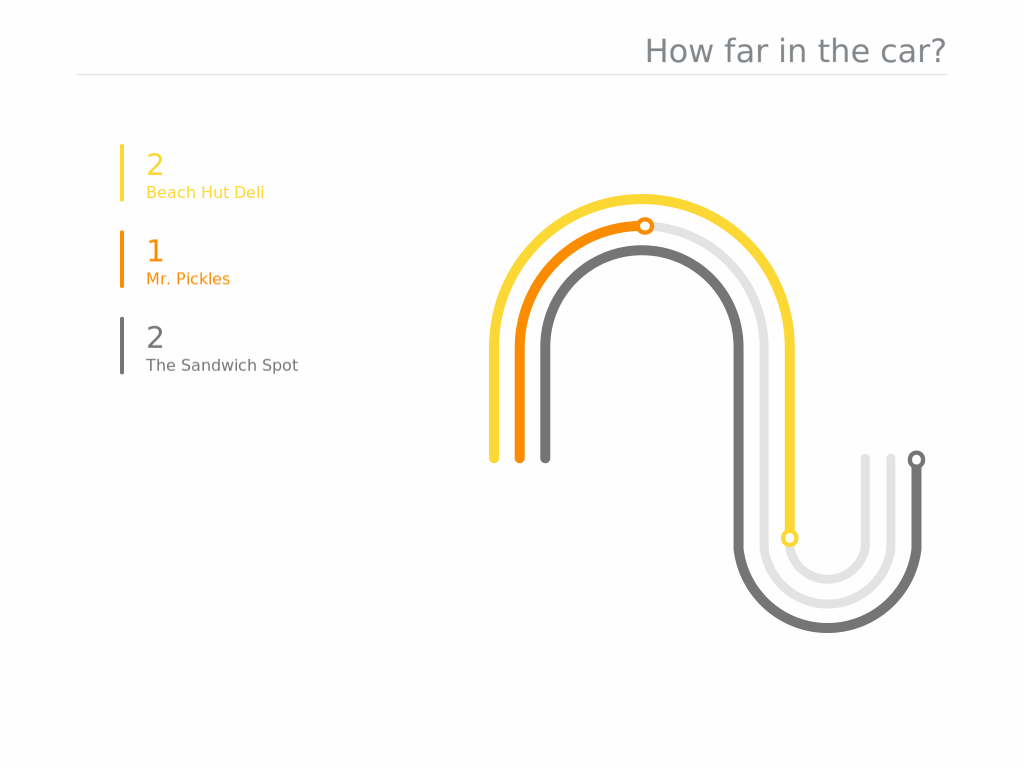
Quick pitch: From the simple data entry step to a few clicks for customization, it took less than 10 minutes to create three GIFs. To practice, I collected and compared information about three local sandwich shops I love, producing visuals about cost, distance from home and number of locations in the area. Here’s a professional example, too.
What I liked: Easy to use. Clean, slick design.
What I learned: The visuals are meant for basic, simple comparisons. The time spent waiting for the GIF to automate is the slowest step. (I also learned this is NOT a new tool. It’s a few years old, and Google provides a nice overview here.)
Good for: Ideal for stories with two or three data points. GIFs grab attention anyway, but this is especially good for a pop of color on the screen in stories where there might not be enough photos or other elements to break up the text.
Limitations or frustrations: In a few places I expected a tool tip or hint when hovering, such as when saving (I assumed “HQ” was high quality and “LQ” was low quality). Also, when I viewed the GIF via the storage link, the quality was noticeably different. The headline has a character count, so write tight!
Helpful hints: Click on the paint bucket to change the colors. If you’re using more than one type of GIF in a story, each type defaults to a different (and clashing) color scheme. Matching the colors definitely looks better. Too bad it doesn’t allow for custom colors.
The bottom line: This is too easy not to use!
This post is part of a series geared toward preparation for the Team Storytelling workshop at JEA Advisers Institute, July 8-11, 2019. Tools featured here have been tested or recommended by workshop facilitators who will be able to offer guidance in person as teams collaborate to produce story packages in New Orleans.

