
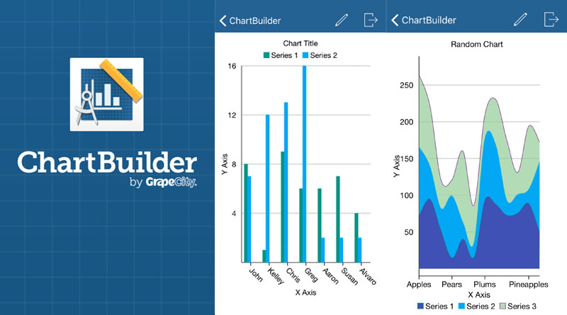

Adding basic data visualizations to any story is easy with ChartBuilder
Some kids just need to start simply. ChartBuilder is a free app that will allow them to display basic numerical data in a simple picture format.
The big idea: ChartBuilder will allow students to build a simple chart/graph with basic numerical data gathered in the field. A quick infographic can be uploaded with a story to give readers a different entry point.
Quick pitch: This would be a great tool for beginning journalism students. More complex graphic apps take time to experiment with to get the best results. This will give students a quick visual to accompany a story, eliminating the use of long drawn-up out descriptions about data in a story.
About the tool: With ChartBuilder, your chart will save as a picture to your phone or tablet, allowing you to upload it quickly and easily. I’d suggest trying the same data you’ve collected in multiple chart forms to see which presentation works best with your layout/design. You can create basic bar, pie, column, area, line and scatter graphs/charts. You can change colors and naming schemes fairly easily.
What I liked: Your finished product saves as an image in your device, so it can easily be inserted into either print or digital media.
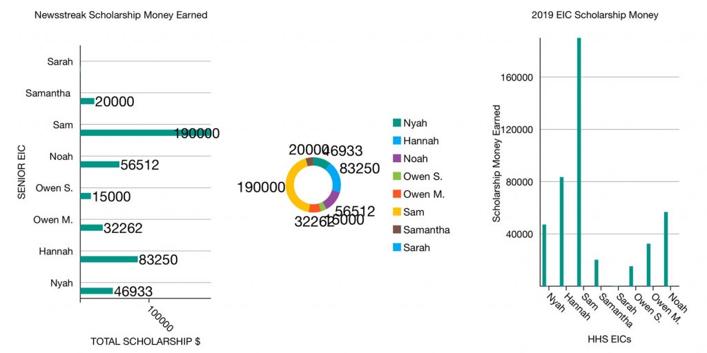
What I learned: It takes a little bit of playing with it to get the hang of customizing the way you want to. There isn’t much help available. It does take a little trial and error. For instance, I was unable to figure out how to reduce the font size of my data, so if the numbers are too large, there is overlap, which makes your graphic look sloppy and unprofessional. I used the same data in three different chart forms (see below) to see how the app adapted for any size restrictions. You have a little wiggle room with alignment of your figures in each chart. Play with those to try to get an acceptable visual. (Notice how the middle chart jumbled the text.)
Good for: Inserting a data-based visual in your storytelling process. It’s simple and quick. If you need to compare data (like figures from one year to the next, for instance), you have the ability to enter multiple series of data.
Limitations or frustrations: Name and save your chart. You can go back and edit it. But if you enter all your data and don’t save, be prepared to enter it again! I could not figure out a way to customize some aspects of the graphics like the width of the bars in the bar chart. ChartBuilder doesn’t offer tutorials in the app and is only available for iOS devices.
Helpful hints: Save, save, save! Although it’s simple, it’s not necessarily intuitive.
The bottom line: It’s a good starting point for kids to understand the importance of using data driven visual journalism to help tell a story. It certainly could be a springboard to designing more complex graphics in an app with more options.
This post is part of a series geared toward preparation for the Team Storytelling workshop at JEA Advisers Institute, July 8-11, 2019. Tools featured here have been tested or recommended by workshop facilitators who will be able to offer guidance in person as teams collaborate to produce story packages in New Orleans.