Dabbling in Big (Or Not So Big) Data and Visualizations
One of my former journalism students is now at the Minneapolis Star-Tribune. When I asked her what skills she’s gained at such a strong publication, she mentioned visualizations first.
“If you can become proficient in Excel and making your own data visualizations, it’s a huge asset,” she said.
As of a few months ago, she was working with Carto (formerly CartoDB) and Datawrapper, and she mentioned that even as a self-proclaimed reporter and writer, she’s finding the programs “pretty intuitive.”
Big Data is a buzzword in journalism now for good reason. Our ability to access incredible volumes of information is possible in a way that wasn’t even a few years ago. However, journalists are also running into the classic issues that come with such information – how to make it both clear and contextual within a deluge of numbers and data points.

Both infographics and visualizations are data crafted into a more easily understood visual form, but there are differences between the two.
Infographics are specific to a certain story, are typically made for this purpose, and are meant to accompany a narrative to which they are attached.
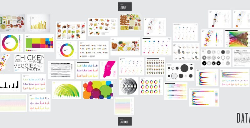
Visualizations are more about the numbers themselves, rather than a specific storyline. They allow the reader to reason inductively about the represented data, to find the lede for him or herself.
You can use this website (and quiz!) to help students see the distinction.
Although the language and use of infographics has been popularly applied since the advent of desktop publishing, the terminology and use of data visualizations is more recent. However, there is some great work being done by journalists in the quickly expanding world of visualizations.
With all this said, how can students begin to train for this new data journalism frontier on a smaller scale?
First, they can start with accessible (and free) programs, like the ones mentioned by Aaron Manfull a few years ago – in addition to the two noted above. These programs, many of which can create both infographics and visualizations, are doable for our digital natives. In essence, no story has to run without a visual element anymore; there are just so many good options out there.
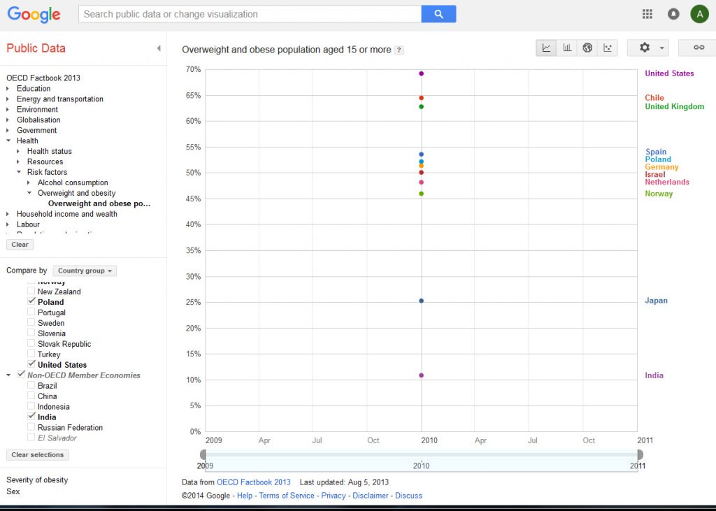
However, if journalism students want to experiment with Big Data, have them work with visualizations from open source data like Google Public Data Explorer (earlier mentioned in Michelle Harmon’s Google News roundup). This can give students support for localizing a larger trend story, or perhaps it can just be a chance to play with a tool that will see growing use in not only journalism but also research into political science, education, sociology, business, and more.
For access to curriculum that would help your beginning students create their first infographics, feel free to use and share my Master Journalism Educator project, which is an online, self-led learning module for creating infographics.


