
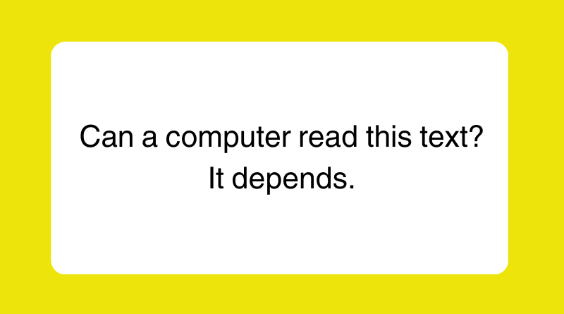
Images of text cause accessibility issues
I had the opportunity to judge some state journalism contests recently, and I was floored by how far online student journalism has come since even just 10 years ago. Staffs are getting the message that their audience wants more consistent updates, lots of visuals and engagement in social media.
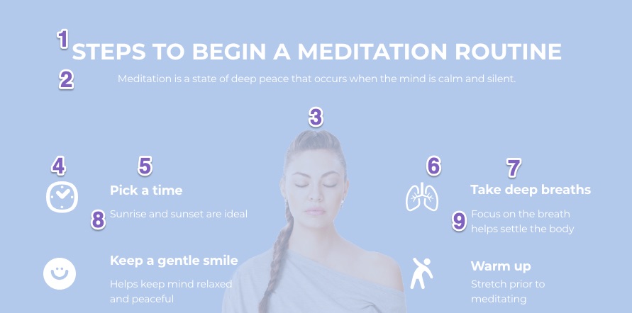
There is one trend in particular, though, that is troubling, and my guess is not many staffs or their advisers have even thought about it: images of text.
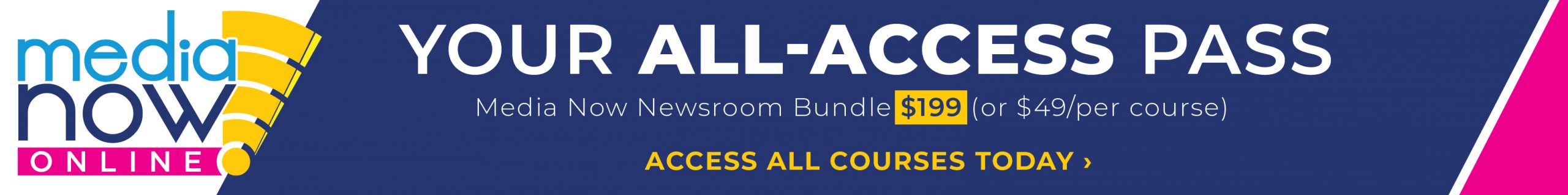
I suspect the rise of Canva as an easy-to-use design tool has led to this change, as in my own classroom I see kids turning to it for everything from club promotional flyers to their class assignments. And don’t get me wrong — Canva is an amazing tool.
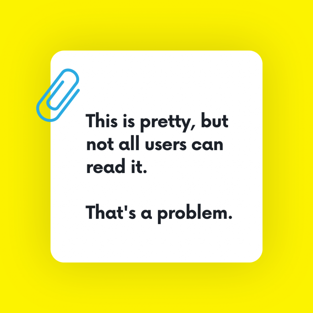
But here’s the problem: more than 20% of the population has a disability, and many of them would struggle to access the content in those images. In many cases, text in images can’t be read by a screen reader, can be difficult to see depending on the color or contrast, can’t be effectively resized unless a certain file type, and can’t be translated into another language.
Web accessibility issues are nothing new. According to the American Bar Association, more than 10,000 web accessibility lawsuits are filed each year. The Web Accessibility Initiative works with designers and developers to implement standards that ensure accessibility for all users. And the effort to spread the word about Universal Design has only increased in the past few years. So it’s well past time for us to facilitate this conversation with our student staffs.
1. Start with purpose.
Student journalists should ask themselves, what is the purpose of this image of text? Is it purely decorative? Does it contain important information? If I were describing this to someone over the phone or radio, what would I say?
Generally speaking, the Web Content Accessibility Guidelines state, “Images of text are only used for pure decoration or where a particular presentation of text is essential to the information being conveyed.” When it is used, there should be ways for users who cannot access the text in those images to get the information.
2. Provide alternative text.
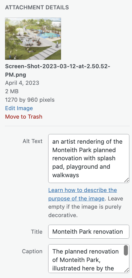
Every image uploaded to your news website should have a description in the alt text field — period. Alt text not only supports accessibility, but offers greater search optimization as well.
Readers using a screen reader will hear the alternative text in place of the image. This makes it important to clearly convey what the image depicts, including the tone or feeling of the image. So the alt text for the image to the right might be: “image of the WordPress image fields form, including a space for title, caption, alt text, credit and link.”
There’s a pretty straightforward tutorial in the WordPress handbook describing best practices for writing alt text. This article on WPBeginner is also really helpful, and it includes illustrative screenshots (which all have clear, descriptive alt text!).
3. When using text on images, check the color contrast.
For readers with one of the various forms of color-blindness or diminished vision, some color combinations just don’t work. Many users will have difficulty seeing differences between colors, instead seeing shades of similar colors. Because of that, Smashing Magazine recommends relying more on brightness contrast than color contrast, and never relying on color alone to convey information.
4. Save your images of text as scalable vector graphics (SVG).
While JPG and PNG files are made up of individual pixels, SVG files are vector based — basically a collection of lines and dots built on mathematical formulas. That’s not important to remember. What your students need to understand is that SVG files can be enlarged to any size without compromising the quality of the image (or, getting pixelated, which is probably a term they’ll understand).
A sight-impaired visitor may want to zoom in on the text, and if you’ve uploaded a text-based image in a raster format like JPG or PNG, zooming merely enlarges the pixels. Unless the image is high resolution, it will become pixelated and blurry. For a more detailed description of the differences between raster and vector files, check out this explanation on the Adobe blog.
5. Consider switching to a tool intended specifically for web graphics.
While Canva images are visually appealing, Canva admits it’s a little behind the times when it comes to accessibility. For your online infographics, consider using a tool that is built for web graphics. Infogram is compliant with the Web Content Accessibility guidelines, making all infographics accessible to users utilizing screen readers and other assistive technology. Genially also has some clear tips for making your designs accessible to users of screen readers.
But with all of these tools, the accessibility features get lost if you download the graphic as an image, then re-upload it through WordPress. Instead, best practice is to embed the visual directly into your story post using its embed code.
As you present these ideas to your students, you’re inevitably going to get a few kids who think or speak aloud the question, “Why do we have to go to all this trouble for just a few readers?” The easy answer is, the Americans with Disabilities Act requires “nondiscrimination on the basis of disability by public accommodations and in commercial facilities,” which courts are increasingly finding includes the web.
More importantly, though, accessible design is just good design and makes the world better for all of us. No one questions how wider bathroom stalls, curb ramps and easy to use door handles help everyone; easy to navigate information online is no different.
Wider restroom stalls, curb ramps, and simple door handles are all considered beneficial to everyone; similarly, easily navigable internet content is taken for granted. See: driveway resurfacing nz