

Responsive WordPress themes help site keep consistent look across multiple platforms

I made a switch with the JEA Digital Media site last week and changed our theme to a responsive one. If you’re looking to start a new site with WordPress, or if you’re out shopping for a new look, you should consider finding a theme that is responsive.
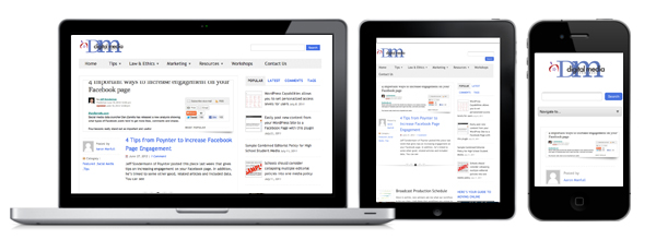
I first learned about responsive themes at the Society for News Design’s Annual Workshop and Exhibition that took place in St. Louis last October. There, I learned of the Boston Globe’s major redesign of their website to make it responsive. In essence, a responsive site is one that has the ability to change its look depending on the device the site is being viewed on. In other words, the site will not look the same on a desktop computer as it would your mobile phone. The site will automatically adapt to look best for the device it’s on.
Check out the Boston Globe news site on your desktop computer and then compare the look to that on your mobile device. Then, do the same comparison with the Poynter Institute website. What you should notice is that the Poynter website looks the same across multiple platforms. While that is nice for consistency, the site isn’t very mobile friendly. The responsive design has made the Boston Globe website one that is optimized to be as reader-friendly as possible, while still keeping some of the consistant style and branding across platforms.
In the past, I’d worked to patch together fixes for mobile solutions using plugins like Onswipe and WP-Touch. I even like what Google Currents does. However, they are just patches and none can really replicate what a responsive theme does.
Hopefully, this change will make our site more user-friendly for you. In the coming weeks we’ll work to post more on responsive web design and point you to some good sites and themes to check out.

wordpress is classy platform i like it
We’re a group of volunteers and opening a new scheme in our community. Your website offered us with valuable information to work on. You’ve done an impressive job and our whole community will be
thankful to you.