Interior site organization creates easier user experience
Since they began working on it in 1996, members of the Carmel (IN) High School HiLite Online student news website team have tweaked the site’s design in an attempt to create an easier experience for readers to find information they need and want.
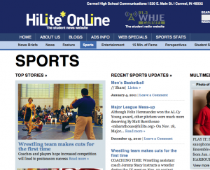
But so often those changes tended to be only to the website’s home page. The interior of the site—basically every page a reader might click on beyond the home page—was simply a chronological listing of the stories in that section—a typical blogroll, in other words. Click on “news” from the home page and readers would be directed to a giant list of news stories with only the latest (and not always the most important) story first.
That approach, so typical in today’s student news websites because of their reliance on blogging content management systems like WordPress, isn’t necessarily a bad thing—at least all of the similar content is compartmentalized together—but it can make a reader’s experience a little more complicated than it needs to be, especially as professional news sites continue to evolve. What this has meant for the HiLite Online team is that they’ve begun to shift their focus from the home page toward those forgotten interior pages of the site.

Just yesterday (Jan. 4, 2011 at this writing), the HiLite web team released a few templates of interior section pages we hope will get tweaked and adjusted even further to make accessing information on the site even easier for our readers.
This idea wasn’t without precedent; there are plenty of examples to look at on the web. Case in point: ESPN.com. On that site, readers can certainly navigate to the home page, which contains a variety of stories from all sorts of sports. Articles and videos about football and basketball blend with articles about hockey and golf. But what if your interests are more specific? What if, say, you want to know only about what’s happening in the NFL? Click on the “NFL” tab in the navigation bar and you’re taken to what looks like another home page. Look carefully, though, and you’ll notice that while the look is similar to the main ESPN home page, all of the stories, videos and other content are now solely about the NFL.
Other sites, including professional news sites like CNN.com, use this concept as well. It’s a trend that’s finally spilling over to student news sites. Some great examples come from the Silver Chips Online out of Montgomery Blair High School (Silver Spring, MD), which has some great interior “home” pages. Likewise, the Paly Voice from Palo Alto (CA) High School utilizes a solid interior structure.
As student news websites become more robust, and as readers become more impatient, it will become increasingly important for site designers to organize. Information is only helpful if it’s easy to find. Search bars are part of that process, but, if they haven’t already, staffs should begin to look beyond their home pages and start organizing the rest of their pages as well. There are plenty of examples out there; find some that you like and experiment.


